mojoPortal.com Makeover

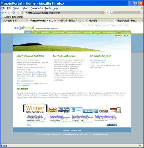
With all the nice looking new skins from my recent skinning campaign, I decided it was time to give mojoPortal.com a makeover. The previous design was about 2 years old and was starting to look a little dated. I also wanted to reduce the clutter on the home page and try to have a more succinct marketing message. I think in the past I've thought that most of my audience were developers so I was packing in a lot of technical information on the home page, but over time I've come to realize I should be targeting more towards business people and emphasizing the business value of mojoPortal more than the technical merits, at least on the home page. So I hope you like the new look!

screen shot of new site design

Gravatar Joe Audette is the founder of the mojoPortal project and was the primary developer until February 2017.

Comments

re: mojoPortal.com Makeover

Friday, May 16, 2008 5:04:52 PM

The new makeover looks great!  I like what you did with the home page.  Very professional :)

re: mojoPortal.com Makeover

Friday, May 16, 2008 7:20:24 PM

Thanks David!

Tom

re: mojoPortal.com Makeover

Friday, May 16, 2008 8:10:54 PM

Looks great, I am using the same skin on one of my sites. How did you the style with mojoPortal and the moto under it?

re: mojoPortal.com Makeover

Saturday, May 17, 2008 7:19:48 AM

Coloring part of the word required wrapping an extra span arround it in the middle of the word like this mojo<span class="green">Portal</span>. Since the <portal:SiteTitle control doesn't have a way to do that I removed it (from layout.master) and hand coded the html for the title and the slogan, then used CSS to style it. You can view the source of the rendered page to see the full markup.

Asad Samarian

re: mojoPortal.com Makeover

Saturday, May 17, 2008 9:57:20 AM

This is best.

bob

re: mojoPortal.com Makeover

Sunday, May 18, 2008 11:41:31 AM

Wow!   That looks really great and clever. Only the blog module looks ugly and doesn't work in Konqueror with the skin now.

Carlos

re: mojoPortal.com Makeover

Saturday, May 24, 2008 10:02:32 AM

Much better. Another step foward !

Tom

re: mojoPortal.com Makeover

Monday, May 26, 2008 9:31:33 AM

How did you get the tabs for child pages to appear below the heading? That relieves the side bar clutter a lot and makes the page look nicer. With the side bar it takes up space and makes the page look narrower then it really is.

re: mojoPortal.com Makeover

Saturday, May 31, 2008 1:40:44 AM

Thank you man

Comments are closed on this post.