SuperFlexi Solutions
SuperFlexi is meant to help front-end developers easily create custom solutions for their client's content-creation needs. With that in mind, we decided to keep things simple and call the whole combination of code you create for your clients a "Solution" (yes, we're always this original). SuperFlexi Solutions are made up of two primary parts: Field Definitions and Markup Definitions, which are closely associated with each other, connected by a GUID, and communicate between each other with tokens. Beyond this you can attach as many other resources as you'd like, whether that be help files, custom CSS that only applies to your solution, an entire JavaScript Library, or any other front end code - but all of that will still revolve around your Field & Markup Definitions, as these are the files that will reference any other resources you include.
The default solutions that ship with mojoPortal v2.6 can be found in the /data/SuperFlexi/Solutions folder. Each folder represents one Solution, they can be named anything you like, what matters is that the .sfMarkup and .sfFields files inside the folder have the right extensions and the right references. Inside the .sfMarkup file, near the top, you'll find your <MarkupDefinition> element, which has attributes that define your solution in various ways. One of these attributes, fieldDefinitionSrc, is the reference to the field definition file for your solution, it looks like this:
<MarkupDefinition
    name="My Solution Name"
    moduleClass="my-class"
    fieldDefinitionSrc="my-fields.sffields"
    fieldDefinitionGuid="00000000-0000-0000-0000-000000000000"
>
    <!-- Markup Definition Stuff -->
</MarkupDefinition>
The value of your fieldDefinitionSrc must be the name of an .sfFields file in the same folder as the .sfMarkup folder, or the solution will not work. If you want to reference a field definition file that isn't in the same folder, you'll need to put in a full path to the field definition, like this:
fieldDefinitionSrc="~/data/SuperFlexi/Solutions/My Other Solution/my-fields.sffields"
Aside from these two files, your solution may also have its own help files, markup files to include on the item edit page, and/or custom CSS & JavaScript files. Typically we put these kinds of files inside a folder named "resources" right inside the solution, to keep things simple, but you can put them anywhere you want as long as you reference them accurately. Scroll down to learn more about references.
If you have trouble understanding this documentation, we recommend that you try experimenting with creating your own solution so that you can get a feel for how things work, and then come back here and read the sections that cover whatever area you need information on. You can also ask for help on the forums.
How Solutions Work
First and foremost, it's important to understand that SuperFlexi is an item repeater - it allows users to create as many "items" as they want inside of it, and it then renders each of those items to the page. Each item exists independently, but they're all treated the same way, and how they're treated is controlled by the solution.
Both sides of your solution are centered around these items. Your field definition will control the way that your user creates & saves their items, and your markup definition will control the way the items are displayed on the webpage.
Field Definitions and Item Edit Pages
Probably the clearest way to communicate how field definitions create your item edit page is with an example. If you create the following field in your field definition:
<Field
    name="caption"
    label="Image Caption"
    controlType="TextBox"
    token="$caption$"
/>
This will produce the following actual input field on your item edit page:
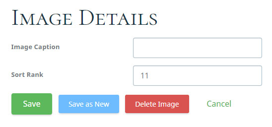 An example field on your SuperFlexi item creation & item edit page.
Note: The "Sort Rank" input is automatically created for all items and isn't defined in your field definition, it just controls the order in which items are rendered out. Higher numbers come last by default. Also, the image above is just an example of one type of field, a TextBox. Lots of field types are possible.
Markup Definitions and Module Content
Following through with the same example from above, let's say you create an item as above, and enter "My Cool Caption" as the value of "Image Caption", like this:
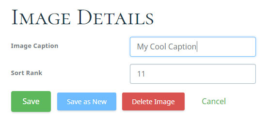 Entering a value into your field.
Then, if your markup definition looks like this:
<ItemMarkup><![CDATA[
	<figure>
		<img src="..." alt="$caption$"/>
		<figcaption>$caption$</figcaption>
	</figure>
]]></ItemMarkup>
You'll get this HTML content on your page when you save your new item:
<figure>
	<img src="..." alt="My Cool Caption"/>
	<figcaption>My Cool Caption</figcaption>
</figure>
Of course this is just a really basic example (realistically we'd have another field for the figure image source and put that token in the value for "src" in the markup definition instead of "..."), but hopefully it illustrates pretty clearly how the markup definition and field definition work together to define your solution.
When you create your solution you can add as many fields to your field definition as you want, and as much markup to your markup definition as you want, and make all sorts of complex HTML structures while still maintaining an easy content creation experience!
Because of the way the stored content interacts with the solution, it is a very bad idea to change what Solution a SuperFlexi module is using after you've already created your items. Don't do that unless you're sure you know what you're doing. Instead, unpublish the module and create a new one to add a different type of solution to your page.
A Bit About Tokens
Your field definition and markup definition communicate primarily by way of tokens, which are arbitrary names attached to each field. You use the tokens within your markup definition to define a template for how the SuperFlexi instance's items will be displayed. When the module loads, it iterates through all of the items that have been created for it. It uses the markup definition as a template, replacing every token inside of it with either the token's static value or the value of the field which that token references, for that particular item.
We typically begin and end our tokens with a $ symbol, because it is something that is not often used anywhere else in HTML. You can define your tokens however you want, but be careful that there is no chance of a token accidentally appearing naturally in your markup.
Dynamic Tokens
Some tokens are defined inside your field definition, we call these tokens "dynamic" because they change for every different solution, in whatever way you decide to change them.
Going back to our "Image Caption" example from above, you'll recall that the field we defined had an attribute named "token", with a value of "$caption$":
<Field
    name="caption"
    label="Image Caption"
    controlType="TextBox"
    token="$caption$"
/>
You should also notice that our markup definition featured this same token:
<ItemMarkup><![CDATA[
	<figure>
		<img src="..." alt="$caption$"/>
		<figcaption>$caption$</figcaption>
	</figure>
]]></ItemMarkup>
And in the generated markup, the area where the token was in the markup definition instead held the value entered into the field which had the same token:
<figure>
	<img src="..." alt="My Cool Caption"/>
	<figcaption>My Cool Caption</figcaption>
</figure>
This is the power of dynamic tokens, you get to create them yourself, define what kind of data they store, define how they appear to the user while items are being created, and define how they are integrated into the item markup. People using your solution don't have to worry about messing with markup, and they can't really break your HTML structure (as they might do accidentally in a WYSIWYG), but they can still produce complicated web content that can be interactive, mobile-friendly, and beautiful (if you build your solution that way!).
Static Tokens
Some tokens are pre-defined by the system, we call these tokens "static" because they never change. They allow us to provide values for things that would not be programmatically accessible from standard HTML like a setting from the current module, or its module ID.
Static tokens that are available globally can be used anywhere within your markup definition. Tokens that are available at an item level are only available within the <ItemMarkup /> element in your markup definition.
| Token |
Description |
Availability |
| $_EditLink_$ |
Gets replaced with the URL to the item edit page. The format of the edit link is defined by the ItemEditLinkFormat element. |
item level |
| $_ItemID_$ |
Gets replaced with the ID of the item. This is incremented for every item, which makes it useful in some cases to help link to items or identify items with a script. |
item level |
| $_SortOrder_$ |
Gets replaced with the value of the "sort order" property on the current item. |
item level |
| $_SitePath_$ |
Gets replaced with the path to the site folder of the current site, ie "/data/sites/1/". |
globally |
| $_ModuleTitle_$ |
Gets replaced with the text of the module's title, but only if the "Show Title?" checkbox is checked in the module's general settings. |
globally |
| $_RawModuleTitle_$ |
Gets replaced with the text of the module's title regardless of whether "Show Title?" is checked. |
globally |
| $_ModuleTitleElement_$ |
Returns the value of the "HTML Element For Title" input on the module's general settings. If you don't see this input at all, you have to enable it in your user.config by adding a key named "EnableEditingModuleTitleElement" and setting it to true. |
globally |
| $_ModuleLinks_$ |
Gets replaced with markup defined by the ModuleLinksFormat element in your markup definition. |
globally |
| $_ModuleID_$ |
Gets replaced with the current module's ID. This will not be the same for two SuperFlexi instances, even if they use the same solution. |
globally |
| $_ModuleGuid_$ |
Gets replaced with the current module's GUID. This will not be the same for two SuperFlexi instances, even if they use the same solution. |
globally |
| $_ModuleClass_$ |
Gets replaced with the value of the "Custom CSS Class" module setting. |
globally |
| $_HeaderContent_$ |
Gets replaced with the content that the user creates in the "header" if "useHeader" is set to true on the MarkupDefinition element. |
globally |
| $_FooterContent_$ |
Gets replaced with the content that the user creates in the "footer" if "usefooter" is set to true on the MarkupDefinition element. |
globally |
| $_FeaturedImageUrl_$ |
Gets replaced with the modules Featured Image URL. Typically this is used either to set an inline CSS background image, or else to render out an <img /> tag with this as it's src. |
globally |
| $_FriendlyName_$ |
Gets replaced with the value of the "Module Friendly Name" module setting. This is useful to allow users to add a friendly "ID" to the module that they can then link to the module with later (assuming you use it that way in your markup definition). If "Module Friendly Name" is left blank, this will default back to the text of the module's title instead. |
globally |
| $_JSONNAME_$ |
Gets replaced with the name of the module's JSON variable. The JSON variable stores the content of all of the SuperFlexi items, but in JSON format. |
globally |
| $_CustomSettings_$ |
Gets replaced with whatever value the "Advanced Settings String" module setting is given (if anything). This is a useful way to create your own settings for the module. For instance, if you have a JavaScript slider that allows you to set the "slide speed", you could instruct content creators to define that using this setting, and then put this token into the script in your markup definition to override the default value if it's set. |
globally |
| $_PageID_$ |
Gets replaced with the ID of the page that the module is published on. This value is different for two SuperFlexi modules on different pages, even if they use the same solution, and the same for two SuperFlexi modules on the same page, even if they use different solutions. |
globally |
| $_PageUrl_$ |
Gets replaced with the URL of the page that the module is published on. This value is different for two SuperFlexi modules on different pages, even if they use the same solution, and the same for two SuperFlexi modules on the same page, even if they use different solutions. |
globally |
| $_PageName_$ |
Gets replaced with the Title of the page that the module is published on. This value is different for two SuperFlexi modules on different pages, even if they use the same solution, and the same for two SuperFlexi modules on the same page, even if they use different solutions. |
globally |
| $_SkinPath_$ |
Gets replaced with the path to the skin folder for the current site. |
globally |
| $_SiteID_$ |
Gets replaced with the ID of the current site, as simple digits. |
globally |
| $_SiteRoot_$ |
Gets replaced with the path to the root of the current site. ~/data/sites/1, for instance. |
globally |
Warning: Because of the way SuperFlexi works, using a token that is only available at an item level outside of the <ItemMarkup /> element in your markup definition will either result in an error or the token being replaced with the value of the token as usual - but only for the last item that was added to the module. We recommend that you don't do this.
Definition GUIDs
Every SuperFlexi Solution has a GUID. Your markup definition and field definition will both have a "definition guid" property, which will just appear as a long string of numbers and letters separated by dashes. This string is a Global Unique Identifier, which is used by the software to track the relationship between the SuperFlexi module's content (which is stored in the database), and the *.sfMarkup and *.sfFields files that are needed to interpret and render that content.
For each solution, the markup definition and field definition must share the same GUID, and this guid must not be changed after you have created your content using the solution. If you change the GUID after changing the content, your content will still exist in the database, but will no longer be tied to your solution, and thus will be inaccessible. If you do this accidentally, you can either restore your old GUID to gain access to your content again, or else delete the orphaned database entries.
Every time you create a new SuperFlexi solution, you should generate a new GUID and paste it into the field and markup definitions. In the field definition, the GUID should appear inside the "definitionGuid" property, like this:
<?xml version="1.0" encoding="utf-8" ?>
<Fields definitionName="My Solution" definitionGuid="00000000-0000-0000-0000-000000000000">
	<!-- Field Definition Stuff -->
</Fields>
And in the markup definition, the GUID should appear inside the "fieldDefinitionGuid" property, like this:
<?xml version="1.0" encoding="utf-8" ?>
<Definitions>
	<MarkupDefinition
		name="My Solution"
		fieldDefinitionSrc="my-solution.sfMarkup"
		fieldDefinitionGuid="00000000-0000-0000-0000-000000000000"
	>
	<!-- Markup Definition stuff -->
</Definitions>
Note: Even if you are copy-pasting an existing solution, not creating one from scratch, it is best practice to replace the GUID in the markup and field definitions with a newly-generated one. This helps prevent you from accidentally ending up with two solutions that have the same GUID.
Per-Site Solutions
You can also create a Solutions folder inside /data/sites/[Site #]/SuperFlexi/, which will ensure that those solutions are only available to a particular site. This can be very helpful if you're running a multi-site install and have different users managing the different sites, and don't want anything getting confused. Note that the SuperFlexi solutions in /Data/SuperFlexi/Solutions will still appear to all site users, but with a "Global" marker next to them.
Note: If you do this and you defined a full path for your fieldDefinitionSrc, or any <Script /> or <Style /> tags in your markup definition, you must remember to add $_SitePath_$/ before the paths to your files and start that path from the site folder.
For instance, if your file is in:
/data/sites/1/SuperFlexi/Solutions/My Solution/myfile.file
Then your reference path should be:
$_SitePath_$/SuperFlexi/Solutions/My Solution/myfile.file
If you don't do this, your files will not be found properly, and your solution will not work correctly. In fact, if the field definition is not found, the solution will not work at all.
Markup Definitions
The markup definition (the .sfMarkup file) is where you specify the HTML markup output of your SuperFlexi solution. It lets you control everything about the HTML that will be rendered by your SuperFlexi module, including wrapping divs, module title & edit links, and any content for the items the user creates. Essentially the markup definition takes what is provided by the field definition and uses it to define what markup is actually rendered to the page, and thus the website viewer's browsing experience. You'll need to understand a bit about tokens before you proceed, learn about them here.
Example Markup Definition:
You can hover over each line of the definition file below to see a pop-up describing what the line means.
<?xml version="1.0" encoding="utf-8" ?><Definitions>	<MarkupDefinition 		name="Example Gallery" 		moduleClass="example-gallery-module"		editPageClass="example-gallery-edit" 		fieldDefinitionSrc="example-gallery.sfFields"		fieldDefinitionGuid="00000000-0000-0000-0000-000000000000"		editPageTitle="Image Details"		editPageDeleteButtonText="Delete Image"		useHeader="false" 		useFooter="false" 		hideOuterWrapperPanel="false" 		hideInnerWrapperPanel="false"		hideOuterBodyPanel="false"		hideInnerBodyPanel="false"	>		<ModuleTitleFormat><![CDATA[<h2 class="example-gallery__title moduletitle" data-moduleid="module$_ModuleID_$">{0}</h2>]]></ModuleTitleFormat>		<ModuleTitleMarkup><![CDATA[$_ModuleTitle_$ $_ModuleLinks_$]]></ModuleTitleMarkup>		<ModuleLinksFormat><![CDATA[<span class="modulelinks flexi-module-links">{0} {1} {2} {3}</span>]]></ModuleLinksFormat>
		<ModuleInstanceMarkupTop><![CDATA[<div id="module$_ModuleID_$" data-contentsection="$_FriendlyName_$" class="example-gallery">]]></ModuleInstanceMarkupTop>		<ModuleInstanceMarkupBottom><![CDATA[</div>]]></ModuleInstanceMarkupBottom>
		<ModuleSettingsLinkFormat><![CDATA[<a class="ModuleEditLink flexi-settings" href="{0}"><span class="fa fa-cog"></span> Settings</a> ]]></ModuleSettingsLinkFormat>		<AddItemLinkFormat><![CDATA[<a class="ModuleEditLink flexi-item-add" href="{0}"><span class="fa fa-plus"></span> Add Image</a> ]]></AddItemLinkFormat>		<EditHeaderLinkFormat><![CDATA[<a class="ModuleEditLink flexi-header-edit" href="{0}">Edit Header</a> ]]></EditHeaderLinkFormat>		<EditFooterLinkFormat><![CDATA[<a class="ModuleEditLink flexi-footer-edit" href="{0}">Edit Footer</a> ]]></EditFooterLinkFormat>		<ItemEditLinkFormat><![CDATA[<a class="ModuleEditLink flexi-item-edit" href="{0}"><span class="fa fa-edit"></span> Edit Image</a>]]></ItemEditLinkFormat>
		<HeaderContentFormat><![CDATA[<div class="example-gallery__header">{0}</div>]]></HeaderContentFormat>		<FooterContentFormat><![CDATA[<div class="example-gallery__footer">{0}</div>]]></FooterContentFormat>
		<ItemsWrapperFormat><![CDATA[<div class="example-gallery__items">{0}</div>]]></ItemsWrapperFormat>
		<ItemsRepeaterMarkup itemsPerGroup="5"><![CDATA[
			<div class="example-gallery__group row fb-parent fb-row fb-wrap">
				$_Items[0]_$$_Items[1]_$$_Items[2]_$$_Items[3]_$$_Items[4]_$
			</div>
		]]></ItemsRepeaterMarkup>
		<CheckBoxListMarkup field="categories" token="$categories$">			<Content><![CDATA[<span data-id="$_ValueItemID_$">$category$</span>]]></Content>		</CheckBoxListMarkup>
		<ItemMarkup><![CDATA[
			<div class="example-gallery__item col-sm-2 fb-shrink fb-grow fb-j-between fb-sm-50 fb-xl-20">
				<figure class="example-gallery__fig">
					<img src="$img$" alt="$caption$" />
					<figcaption class="example-gallery__caption">$caption$ $categories$ $_EditLink_$</figcaption>
				</figure>
			</div>
		]]></ItemMarkup>
		<Styles>			<Style name="exampleGalleryBaseCSS" href="$_SitePath_$/SuperFlexi/Plugins/css/example-gallery-base.css" RenderAboveSSC="true"></Style>		</Styles>
		<Scripts>			<Script position="bottomStartup" name="exampleGalleryScript" src="resources/gallery-script.js"></Script>		</Scripts>
	</MarkupDefinition>
	<SearchDefinition>		<Title>Image: $caption$</Title>		<Keywords>$categories$</Keywords>		<Description>An image in the image gallery</Description>		<Link>$_PageUrl_$</Link>	</SearchDefinition>
</Definitions>
Attributes of a Markup Definition
You'll notice that the <MarkupDefinition /> element at the top of your markup definition has a lot of attributes. Here's a quick rundown of possible attributes and what they do:
| Property |
Description |
Default |
Required |
| name |
An arbitrary name for your solution. What you enter here is what will appear in the drop-down list on every SuperFlexi module's settings page. |
n/a |
Yes |
| moduleClass |
Any CSS class that you'd like added to the OuterWrapperPanel of the SuperFlexi module (this will be appended to the class determined in your skin's theme.skin file, and will not replace it). |
n/a |
no |
| editPageClass |
Any CSS class that you'd like to add to the <body /> of the SuperFlexi module's Add Item & Edit Item pages. |
n/a |
no |
| fieldDefinitionSrc |
The name of your .sfFields file. This file should be inside of the solutions root folder, just like your markup definition. |
n/a |
Yes |
| fieldDefinitionGuid |
Here you should supply a randomly genered GUID. Unsure what this is? Read the section about GUIDs. |
n/a |
Yes |
| editPageTitle |
A string that will be used as the text for the page title of the SuperFlexi module's Add Item & Edit Item pages. |
"Edit Item" |
no |
| editPageDeleteButtonText |
A string that will be used as the text for the "delete" button on the SuperFlexi module's Add Item & Edit Item pages |
"Delete Item" |
no |
| useHeader |
A bool (true or false value) that deteremines whether the solution utilizes the "header" content feature. If this is false, the <EditHeaderLinkFormat /> element in your Markup Definition will not be rendered, and neither will the header content itself. |
"true" |
no |
| useFooter |
Exactly as the useHeader bool above, but for the footer content. |
"true" |
no |
| hideOuterWrapperPanel |
A bool which determines if the OuterWrapperPanel will be rendered. This overwrites whatever Base Panel settings are configured in the theme.skin |
"false" |
no |
| hideInnerWrapperPanel |
A bool which determines if the InnerWrapperPanel will be rendered. This overwrites whatever Base Panel settings are configured in the theme.skin |
"false" |
no |
| hideOuterBodyPanel |
A bool which determines if the OuterBodyPanel will be rendered. This overwrites whatever Base Panel settings are configured in the theme.skin |
"false" |
no |
| hideInnerBodyPanel |
A bool which determines if the InnerBodyPanel will be rendered. This overwrites whatever Base Panel settings are configured in the theme.skin |
"false" |
no |
| processItems |
Set this value to false if you want your markup definition to not output any items or item JSON onto the page. This is useful if you are using the web API to query your items manually.
|
"true" |
no |
| jsonRenderLocation |
This setting determines where the JSON (an object that contains the item data) that SuperFlexi produces renders. Where the script renders will determine the scope of access to the variable that stores the JSON.
Possible values:
- inHead
- inBody
- aboveMarkupDefinition
- belowMarkupDefinition
- bottomStartup
|
"inBody" |
no |
| showSaveAsNewButton |
A bool which determines if the "Save as new" button shows on the item edit page. This allows users to click a button to duplicate the item - they can also make changes on the edit page and save a new item this way, without having to enter in equal values for fields that don't need to be changed for the new item. |
"true" |
no |
| maxItems |
This lets you set a maximum number of SuperFlexi items that can be created with this solution. If it is -1, any number of items is allowed. You can set it to 0 to prevent any items from being allowed, or any int greater than 0 to set a max number. |
"-1" |
no |
Elements in a Markup Definition
The Elements of a Markup Definition are the various XML tags that help you define the way that your solution is rendered. Most of these amount to some HTML value with tokens inside it. The tokens then get replaced by values based on either the module settings that the user sets on a SuperFlexi instance, or the SuperFlexi items that a user creates.
A token is considered to be "Static" if it has a value pre-defined by the system (not based on user input), and "Dynamic" if the real value is defined by the user. Read more about tokens here.
- ModuleTitleFormat allows you to create an HTML format string that will be rendered wherever the $_ModuleTitle_$ static token is placed in the Markup Definition. Inside this format, the {0} string represents a text-only string of the module's title. Nothing inside of ModuleTitleFormat will be rendered at all if the "Show Module Title?" checkbox is not checked in the SuperFlexi module's general settings. Because the solution and the module are entirely different things, you should always make allowance for the possible values of all module settings.
- ModuleLinksFormat allows you to create an HTML format string that will be rendered wherever the $_ModuleLinks_$ static token is placed in the Markup Definition. Inside this format, {0} represents the content of ModuleSettingsLinkFormat, {1} represents the content of AddItemLinkFormat, {2} represents the content of EditHeaderLinkFormat, and {3} represents the content of EditFooterLinkFormat. Remember that it is vital for the end user to have access to these links while administrating their content, so try not to place $_ModuleLinks_$ inside anything with conditional rendering, like ModuleTitleFormat or ItemMarkup (which won't render until after an item exists).
- ModuleSettingsLinkFormat allows you to create HTML that will be wrapped around the "settings" URL for any SuperFlexi module using your solution. The {0} inside this represents the URL to the module's settings page. Typically, the HTML format string here will be some variant of this:
<a href="{0}">Settings</a>.
- AddItemLinkFormat allows you to create HTML that will be wrapped around the "add item" URL for any SuperFlexi module using your solution. The {0} inside this represents the URL to the module's item creation page. Typically, the HTML format string here will be some variant of this:
<a href="{0}">Add Item</a>.
- ItemEditLinkFormat allows you to create an HTML format string that will be rendered wherever the $_EditLink_$ static token is placed inside of the ItemMarkup element. This HTML will be wrapped around the URL to the module's item edit page. {0} represents the dynamically generated URL of the edit page. Typically, the HTML format string here will be some variant of this:
<a href="{0}">Edit Item</a>.
- EditHeaderLinkFormat allows you to create HTML that will be wrapped around the "edit header" URL for any SuperFlexi module using your solution. The {0} inside this represents the URL to the module's header WYSIWYG page. Typically, the HTML format string here will be some variant of this:
<a href="{0}">Edit Header</a>.
- EditFooterLinkFormat allows you to create HTML that will be wrapped around the "edit footer" URL for any SuperFlexi module using your solution. The {0} inside this represents the URL to the module's footer WYSIWYG page. Typically, the HTML format string here will be some variant of this:
<a href="{0}">Edit Footer</a>.
- ModuleTitleMarkup is used to determine content that will be placed at the top of the module, inside the same panels as the default mojoPortal moduletitle (if those panels are present). Typically we put $_ModuleTitle_$ (which renders out the content of ModuleTitleFormat) and $_ModuleLinks_$ (which renders out the content of ModuleLinksFormat) inside of this, but they can be placed elsewhere, and other content can be placed here.
- ModuleInstanceMarkupTop is simply a place for you to dump HTML markup into the top of the module. We've usually used it to add custom wrapper panels around the markup, by opening an HTML div tag inside this and closing it inside ModuleInstanceMarkupBottom.
- ModuleInstanceMarkupBottom - As with ModuleInstanceMarkupTop, this is just a place where you can dump HTML into the module, but this time it will be dumped at the bottom. We often put closing element tags in here to wrap the whole module in an extra panel.
- HeaderContentFormat - The "Header" is intended to allow your users to add simple intro content to the module that is separate from the module's items. Sometimes adding unique content before the item list is useful. This allows you to create an HTML format string for content that will be rendered just before the item list. {0} represents the HTML content of the "header" as specified by the user. The EditHeaderLinkFormat below defines the edit link that allows the user to create this content. This content is only rendered if the "useHeader" attribute on the MarkupDefinition tag is set to "true".
- FooterContentFormat is exactly the same as the HeaderContentFormat, except that it belongs to the footer content, which is placed below the item list instead of above it. {0} represents the footer content. This content is only rendered if the "useFooter" attribute on the MarkupDefinition tag is set to "true".
- CheckBoxListMarkup is used to render out the contents of fields of type DynamicCheckboxList. This should not be used if your field definition doesn't contain a field of this type. If you do have a DynamicCheckboxlist field, you should set the value of the "field" attribute on this CheckBoxListMarkup element to the value of the "name" attribute on your field, which tells the CheckBoxListMarkup which field to use (this is necessary because it is possible to have multiple CheckBoxListMarkup elements in your markup definition). The value of the "token" property of your CheckBoxListMarkup element should be set to any arbitrary token value, which can then be placed elsewhere in your markup definition to represent where the
<content /> should be rendered - this token can be placed in the ItemMarkup, or elsewhere in your markup definition. If it is placed in ItemMarkup, it will render the "checked" value for an item inside that item. If it is placed anywhere outside of ItemMarkup, it will render all checked values for any item once.
- Child Elements:
- 1. The
<content /> child element is required, it is used to define HTML to render out for each of the DynamicCheckboxList field's "checked" checkboxes. Typically this contains the value of the "token" attribute of the DynamicCheckboxList field, which will render out the checked value for your item. It can also include these static tokens: $_CBLValueCount_$ which lists the number of "checked" items with the same value, and $_ValueItemId_$ which is the Item ID of the SuperFlexi Item that the value is "checked" in. Example:
<Content><![CDATA[<li data-id="$_ValueItemID_$" >$my-field-token$ <span>$_CBLValueCount_$</span></li>]]></Content>
- 2. You can optionally use the
<Separator /> element to define content that will be placed between each of the rendered <content /> elements. For instance, this will render a comma and a space between each item (and at the end):
<Separator><![CDATA[, ]]></Separator>
- ItemsWrapperFormat allows you to define HTML content to wrap all of your SuperFlexi items. This content only gets rendered once for your SuperFlexi module.
- ItemsRepeaterMarkup is used to create sets out of your items. You can use this to wrap every X number of items in any markup you'd like, where "X" is the value of the "itemsPerGroup" attribute on this element. Then, inside your wrapper, you include tokens that represent each item, with the format $_Items[0]_$, where "0" is the index of the item. This token should be included once for every number between 0 and the value of itemsPerGroup. So for instance, if itemsPerGroup were 3, $_Items[0]_$ would represent the first item in the group, $_Items[1]_$ the second, and $_Items[2]_$ the last. Note that because it is a zero-based index, $_Items[3]_$ is not included.
- ItemMarkup is perhaps the most important element in your markup definition. It controls the markup output of each SuperFlexi item, and is the main place where you use Dynamic Tokens. It essentially functions as an item template. When you create your field definition and define your tokens, you then use your tokens inside this template, and the values that the end-user enters when creating each item will be placed into the markup in the place of their respective tokens. This markup is rendered independently for each item in the SuperFlexi module that is using your solution. The $_EditLink_$ static token is also used here, which represents where the ItemEditLinkFormat content will go - this is important to allow your users to edit their items.
- Styles allow you to include references to CSS files elsewhere in your solution, or else to use CDATA to define styles inline. For each
<Style /> element inside of this element, one CSS link will be added to the page. Each <Style /> element should contain certain properties. Learn about these below.
- Scripts allows you to include a reference to a JavaScript file elsewhere in your solution, or else to use CDATA to define a script inline. For each
<Script /> element inside of this element, one script call will be added to the page. Each <Script /> element should contain certain properties. Learn about these below.
Content inside of the "Settings", "Add", and "Edit" link formats will only be rendered for users who are logged in with edit permissions.
Adding Custom CSS File Calls
You may often want to include some CSS to go along with your SuperFlexi solution. Sometimes it is best to simply include all the CSS for your solution inside your mojoPortal skin (this way it is cached well), but sometimes you may only want that CSS to be loaded onto a page if the solution is also there. The <Styles /> element in your markup definition is the key to accomplishing this. One HTML <link rel="stylesheet" href="yourfile.css" /> will be added to your DOM for each <Style /> element added inside the Styles list in your markup definition. These style elements will need the following properties:
- name is used to set an arbitrary name for your CSS file. This allows us to prevent multiple calls from happening if the same SuperFlexi solution is used multiple times on the same page. Note that this name should be fully unique - don't use the same "name" value for two different CSS files in two different SuperFlexi solutions.
- href is used to reference a CSS file, relative to the solution folder. For instance, if your style is in
/SuperFlexi/Solutions/My Solution/resources/my-style.css, your "href" can simply be "resources/my-style.css".
- renderAboveSSC is used to determine whether the CSS link will be added above mojoPortal's Style Sheet Combiner, or below it. This matters because CSS that is lower in the DOM will overwrite CSS that is higher if they have the same specificity in their selectors.
As an example, here's the CSS file call from the markup definition of the "Icon Blocks" solution that ships with mojoPortal:
<Styles>
	<Style name="iconBlockBaseCSS" href="resources/icon-blocks-base.css"></Style>
</Styles>
You can also add CSS calls to your field definition to load CSS for your solution only on the Item Add and Item Edit pages. The syntax is exactly the same, you'll just need to place it somewhere inside the <Fields /> element in the field definition.
Adding Custom Script File Calls
One of the most useful things about SuperFlexi is that it can make it very easy for your end-users to create complex HTML without even knowing they're doing it. Naturally, some of the best implementations of this involve utilizing JavaScript plugins (like sliders, table sorters, etc) that require specific markup. Implementing a JavaScript plugin with SuperFlexi is easy, you just need to define your starting HTML markup in your markup definition (usually inside ItemMarkup), and then add a script call. To add a script call, add a <Scripts /> element into your MarkupDefinition, and then one <Script /> element inside of it for each script file you'd like to call. These script elements will need to have the following properties:
- position is used to set where the script call is added to the DOM. Accepted values are inHead, inBody (default), aboveMarkupDefinition, belowMarkupDefinition, and bottomStartup (which adds the call to the very bottom of the body).
- name is used to set an arbitrary name for your script. This allows us to prevent multiple script calls from happening if the same SuperFlexi solution is used multiple times on the same page. Note that this name should be fully unique - don't use the same "name" value for two scripts in two different SuperFlexi solutions, unless you still only want them to be rendered once.
- src is used to reference a script file, relative to the solution folder. For instance, if your script is in
/SuperFlexi/Solutions/My Solution/resources/my-script.js, your "src" can simply be "resources/my-script.js".
As an example, here's the script calls from the markup definition of the slider solution that ships with mojoPortal:
<Scripts>
	<Script position="bottomStartup" name="SlickJS" src="resources/slick/slick.min.js"></Script>
	<Script position="bottomStartup" name="ContentSlider" src="resources/content-slider.js"></Script>
</Scripts>
You can also add Script calls to your field definition to load Script for your solution only on the Item Add and Item Edit pages. The syntax is exactly the same, you'll just need to place it somewhere inside the <Fields /> element in the field definition.
Search Definitions
Note: This search definition will only affect the internal mojoPortal search handler, it will have absolutely no impact on Google or any other external search provider. For that, you will just have to make sure you follow good SEO practices when creating your skin, site content, and markup definitions.
Sometimes you may want to return custom search results to the internal mojoPortal search feature, based on your fields. Sometimes your content itself is too complex to be properly displayed on the search results page directly. You can build custom search results pretty easily with SuperFlexi by defining a search definition, and you can use the same tokens in the search definition that you use in the <ItemMarkup /> loop in your markup definition.
You can define the search definition in your markup definition, it must be a direct child of the <Definitions /> element, not nested in any other elements. We usually put it at the very bottom of our markup definitions, to make it easy to find.
The $_PageUrl_$ token below is a static token - it represents the URL of the page that any search listing's content comes from. This is here so you can append properties to it for use in scripts.
Example Search Definition:
<SearchDefinition>
    <Title>$title$</Title>
    <Keywords>$categories$</Keywords>
    <Description>$content$</Description>
    <Link>$_PageUrl_$</Link>
</SearchDefinition>
Field Definitions
Field Definitions are configuration files that let you use XML to control what kind of content fields your SuperFlexi solution will handle. Each <field /> in your field definition file will directly create a new input on the page that content creators will see when they go to create new items using your solution in mojoPortal. Each field that you create is identified by a "token" property, which then can be used within the markup definition. When the page is being rendered, the tokens from your markup definition will be replaced with the values that the end-user saved within each item they created.
If you haven't already, we recommend you read the how solutions work section, it will help you understand how the field definition interacts with the markup definition.
Example Field Definition:
You can hover over each line of the definition file below to see a pop-up describing what the line means.
<?xml version="1.0" encoding="utf-8" ?><Fields definitionName="Image Blocks" definitionGuid="00000000-0000-0000-0000-000000000000"> <Field name="caption" label="Image Caption" controlType="TextBox" required="True" requiredMessageFormat="Caption is required." token="$caption$" editPageControlWrapperCssClass="settingrow gallery-setting-row" editPageLabelCssClass="settinglabel gallery-label" editPageControlCssClass="form-control gallery-caption-input" sortOrder="100" /> <Field name="img" label="Image" controlType="ImagePicker" required="True" requiredMessageFormat="Image is required." token="$img$" editPageControlWrapperCssClass="settingrow gallery-image-row" editPageLabelCssClass="settinglabel gallery-label" editPageControlCssClass="form-control gallery-image-input" sortOrder="110" /> <Field name="categories" label="Image Categories" controlType="DynamicCheckBoxList" required="false" token="$categories$" editPageControlWrapperCssClass="settingrow cats-wrap gallery-cats-wrap" editPageLabelCssClass="settinglabel cats-label gallery-label" editPageControlCssClass="forminput list-inline cats-list gallery-cats-list" sortOrder="120" /> </Fields>
Field Types
When you're creating your Field Definition you'll be building the fields that are available to your user when they're creating their items. You can control what kind of input a field will in up becoming by editing the ControlType attribute of the <field /> in your field definition.
For Example, this creates a text box field:
<Field
	name="title"
	label="Title"
	controlType="TextBox"
	token="$title$"
	sortOrder="100"
/>
Note: Some attributes on fields are required, but for the sake of readability we will not list all the required attributes for each field below. Where you see '...', you need to add all required attributes like name, label, token, and sortOrder.
Valid Control Types:
- TextBox
-
Creates a simple text box field. This is the default value for ControlType.
<Field
	...
	controlType="TextBox"
	textBoxMode="MultiLine"
	...
/>
The 'textBoxMode' attribute allows you to change between different kinds of text boxes. Acceptable values are:
- "SingleLine" (default)
- "MultiLine" - Creates a
<textarea />
- "Password" - A textbox that visually obscures its value
- "Email" - Depending on browser support, this textbox automatically checks if the entered value is an email address.
- "Number" - Only allows numbers to be entered. You can use attributes to define min and max values.
- "Range" - Allows a certain range of numbers to be entered.
- "Phone" - Used for input fields that should contain a telephone number. Currently unsupported in most browsers.
- "Url" - Depending on browser support, the URL field can be automatically validated.
- LinkPicker
-
Offers the user an input to enter a URL into, as well as a "choose file" button to browse for a file to link to via the File Manager. There will also be a "pick a page" button above the file manager, which allows users to select a page from their own sitemap.
<Field
	...
	controlType="LinkPicker"
	...
/>
- ImagePicker
-
Allows the user to link to an image or upload a new one via the File Manager, with a fallback image.
<Field
	...
	controlType="ImagePicker"
	imageBrowserEmptyUrl="$_SitePath_$/media/blank.gif"
	...
/>
Note: imageBrowserEmptyUrl determines what image is used if no image is selected. The default value is "~/Data/SiteImages/blank.gif".
- CheckBox
-
A single checkbox that stores true or false values. Use your label to ask simple true or false questions, by default. If you need more complex data stored, you can use custom return values.
<Field
	...
	controlType="CheckBox"
	...
/>
- CheckBoxList
-
A list of checkboxes which users can select any number of. Each checkbox is defined as an 'Option' of the CheckBoxList. The option 'name' defines the label for the checkbox, and the 'value' defines the return value if the checkbox is checked. If the checkbox is not checked, nothing will be returned for it.
<Field
	...
	controlType="CheckBoxList"
	...
>
	<Options>
		<Option name="Red?" value="red" />
		<Option name="Blue?" value="blue" />
		<Option name="Green?" value="green" />
	</Options>
</Field>
- RadioButtons
-
A list of options which users can select only one of. Each button is defined as an 'Option' of the RadioButtons item. The option 'name' defines the label for the button, and the 'value' defines the return value for each button if it is the one selected.
<Field
	...
	controlType="RadioButtons"
	...
>
	<Options>
		<Option name="Option 1" value="one" />
		<Option name="Option 2" value="two" />
		<Option name="Option 3" value="three" />
	</Options>
</Field>
- DynamicCheckBoxList
-
This is just like the CheckBoxList, but instead of defining your own checkboxes you let the users create them as they go. Any time a user enters a new value, a new checkbox will be added for all future items in the same module. If a checkbox goes unchecked across all items in the module, it will be removed from the list. To use the dynamic values in your markup definition, use the CheckBoxListMarkup element.
<Field
	...
	controlType="DynamicCheckBoxList"
	isGlobal="False"
	...
/>
Note: The 'isGlobal' setting determines whether added CheckBox values should be available to all items across any SuperFlexi module using the same solution. If so, you can add a value in one module's item and then go to another module and see the same value in the list. This also applies to the deletion behavior - values will only be deleted if they remain unchecked across all items in all modules using the same solution.
- DynamicRadioButtonList
-
This is just like the DynamicCheckBoxList, but only allows users to select one value. As with the DynamicCheckBoxList, if a created option goes unselected across all items in the module, it will be deleted.
<Field
	...
	controlType="DynamicRadioButtonList"
	isGlobal="True"
	...
/>
Note: The 'isGlobal' setting determines whether added RadioButton values should be available to all items across any SuperFlexi module using the same solution. If so, you can add a value in one module's item and then go to another module and see the same value in the list. This also applies to the deletion behavior - values will only be deleted if they remain unselected across all items in all modules using the same solution.
- Dropdown
-
Creates a simple drop-down list (a <select /> element). Users can choose one of a set of defined values for each item, and that value will be the value that the fields token is replaced by in the markup definition.
<Field
	...
	controlType="Dropdown"
	...
>
	<Options>
		<Option name="Chevy" value="chevy" />
		<Option name="Ford" value="ford" />
		<Option name="Honda" value="honda" />
	</Options>
</Field>
- DateTime
-
Allows users to select a date and (optionally) time. This input uses the jQueryUI date picker.
<Field
	...
	controlType="DateTime"
	dateFormat="M/d/yyyy"
	datePickerIncludeTimeForDate="false"
	datePickerShowMonthList="false"
	datePickerShowYearList="false"
	datePickerYearRange=""
	...
/>
Note: Values shown above are the defaults. dateFormat has a default value set by the site Culture. datePickerYearRange accepts string values, you can learn more here.
- ISettingControl
-
You can use ISettingControl if you already have something set up with it elsewhere in mojoPortal, but if not we recommend you use CustomField instead.
<Field
	...
	controlType="ISettingControl"
	controlSrc="~/path/to/your/custom/control.ascx"
	...
/>
- CustomField
-
Using this you can create your own field type, simply supply the path your control via the controlSrc attribute. You can create any custom attributes you like and pass them to your control for handling, as well.
<Field
	...
	controlType="CustomField"
	controlSrc="~/path/to/your/custom/control.ascx"
	...
/>
Field Options
Here is a list of valid attributes for all fields. Attributes that are only available for certain field types will be listed above, under their respective Field Types.
| Attribute |
Description |
Default |
Required |
| name |
An arbitrary name for your field. Not displayed to the user. Used internally to identify the field. Do not name two fields the same thing. |
n/a |
Yes |
| label |
A string that creates the setting label seen by the user when they are creating items. The label typically sits above the actual field on the item edit page. |
n/a |
Yes |
| controlType |
Determines what kind of field should be rendered, what kinds of values can be accepted and saved, and what UI is presented to the user as they create their items. See a full list of available field types here. |
TextBox |
Yes |
| controlSrc |
Sets the path to the control to be used for the field. This is a required attribute for fields of type ISettingControl and CustomField. |
n/a |
~ |
| required |
Determines whether the given field must have a value for the item to save. Accepts a bool value.
|
False |
no |
| requiredMessageFormat |
A string to display to the user when a required field is empty when they try to save. For instance "Title is required. Please enter a title." |
n/a |
no |
| regex |
Add an optional regex match for a field. This functions independently from the 'required' attribute, which allows you to ensure that if a field has a value it matches your pattern, but still allow it to not have a value at all. |
n/a |
no |
| regexMessageFormat |
Sets the text of the error message that shows to the user if the regex pattern match fails for your field. |
n/a |
no |
| defaultValue |
Set a default text string value for an input. In some cases you want a field to be required to have a value, but don't want to insist that the user enter the same value for every new item. |
n/a |
no |
| token |
An arbitrary string used to reference the field in the Markup Definition. If this value is "$title$", anywhere that the string "$title$" exists in the Markup Definition it will be replaced with this fields value, for each item. |
n/a |
Yes |
| editPageControlWrapperCssClass |
Determines the CSS Class of the div wrapping the field on the item edit page. |
"settingrow" |
no |
| editPageLabelCssClass |
Determines the CSS Class of the field label on the item edit page. |
"settinglabel" |
no |
| editPageControlCssClass |
Determines the CSS Class of the field input itself (what element this class appears on depends on what field type you choose). |
"forminput" |
no |
| editPageControlCssClass |
Determines the CSS Class of the field input itself (what element this class appears on depends on what field type you choose). |
"forminput" |
no |
| isSearchable |
Sets whether a given field value can be found by the internal mojoPortal search feature. This has no impact on external search features like Google. |
"true" |
no |
| isDeleted |
This is used to set a field value as 'deleted' - which prevents it from having a value at all. You can use the token of another field, a checkbox for instance, if you want users to be able to mark an field as deleted but still save the values. It could also be used to control publishing for the field. This functionality might strike you as odd, we built it for a particular scenario with a client and decided to keep it. |
"false" |
no |
| helpKey |
Used to create help content for your end-user. Learn more about this in the help files section. |
n/a |
no |
Custom Checkbox Return Values
Sometimes you want to have a simple checkbox that collects a yes/no value from the user, but stores something a little more complex for use elsewhere. You can store whatever value you want in place of the "true" or "false" values of your checkbox. Use the following attributes on your field:
- checkBoxReturnBool - This controls whether the checkbox saves "bool" type values. This defaults to "true", you'll need to set it to "false" to use the custom values below.
- checkBoxReturnValueWhenTrue - Stores a value that is returned if the checkbox is checked.
- checkBoxReturnValueWhenFalse - Stores a value that is returned if the checkbox is unchecked.
For instance, you might have a checkbox labeled "Show Background Image?" which you want to use to toggle the appearance of an image behind your item. You can then do this in your field definition:
<Field
	name="usebg"
	label="Show Background Image?"
	controlType="CheckBox"
	token="$use-bg$"
	checkBoxReturnBool="false"
	checkBoxReturnValueWhenTrue="enable-bg-image"
	checkBoxReturnValueWhenFalse="disable-bg-image"
/>
And this in your markup definition:
<ItemMarkup><![CDATA[
	<div class="my-cool-item $use-bg$">
		<p>other item content here</p>
	</div>
]]></ItemMarkup>
To get this HTML output for an item if "Show Background Image?" is checked:
<div class="my-cool-item enable-bg-image">
	<p>other item content here</p>
</div>
Then just use CSS to show/hide your image. You can use this functionality to accomplish a lot of things while maintaining the simplicity of true/false questions for the content creator.
Pre & Post Token Strings
At some point, you may need to create markup to be rendered around a value in your markup definition, but you don't want the markup to be rendered at all unless the value exists. The Pre and Post token strings are meant to solve this problem. You can define values to be added before and after the token, but only if the token has a value, like this:
<Field
    name="myfield"
	label="My Field"
	controlType="TextBox"
	token="$my-cool-field$"
>
    <PreTokenString>
        <![CDATA[<p>My Stuff Before</p>]]>
    </PreTokenString>
    <PostTokenString>
        <![CDATA[<p>My Stuff After</p>]]>
    </PostTokenString>
</Field>
Using other tokens inside Pre & Post
Because you define your tokens in your field definition, it might seem odd to also use the tokens here, but it is possible. As long as the token is only used in a value for something that is rendered content (not a setting), and as long as the field which the token represents shows up after where the token is used in the field definition, it can be used inside the attributes of another field.
As an example, imagine you want your user to enter a URL value, but you don't want them to be required to enter in the URL - you don't want to have <a href="$url-token$">$text-token$</a> in your markup definition then, because then it will create invalid HTML if $url-token$ isn't populated.
To solve this, you'll simply want to define your link markup using the Pre and Post token strings - that way it will only render if the URL exists:
<Field
    name="makeitalink"
    label="Make My Textbox A Link?"
    controlType="CheckBox"
    token="$makeitalink$"
    sortOrder="110"

    checkBoxReturnBool="false"
    checkBoxReturnValueWhenTrue="$url-token$"
    checkBoxReturnValueWhenFalse="$text-token$"
/>

<Field
    name="mylinkbox"
    label="My URL"
    controlType="LinkPicker"
    token="$url-token$"
    sortOrder="120"
>
    <PreTokenString>
        <![CDATA[<a href="]]>
    </PreTokenString>
    <PostTokenString>
        <![CDATA[">$text-token$</a>]]>
    </PostTokenString>
</Field>

<Field
    name="mytextbox"
    label="My Textbox"
    controlType="TextBox"
    token="$text-token$"
    sortOrder="100"
/>
And this in your markup definition file:
<ItemMarkup><![CDATA[
	$_EditLink_$
	$makeitalink$
]]></ItemMarkup>
Notice that the token we use is the token of the checkbox, which allows us to render out just the text value if the checkbox isn't checked, and render our link if the checkbox is checked. This can be used for all kinds of things where you want the user to choose between different markup layouts for your item.
Fun fact: You can also use the same token more than once in a markup definition. If you want the token to render in one place with the pre/post token strings, and in another without it, you can add a "^" before the token to prevent the rendering of the pre-token string, and after the token to prevent the render of the post-token string. So ^$text-token$^ now renders just the text, not the link.
Instruction Blocks
Sometimes it is helpful to be able to guide your user by adding instructions to the Item Edit page. You can use the following code in your field definition file to load in reference content:
<Field
    name="myinstructionblock"
    label="Help Me"
    controlType="InstructionBlock"
    helpKey="help-me.sfHelp"
    sortOrder="999"
/>
This can also be used to load HTML into the field edit page, which means you can use it to wrap your fields in divs and do all sorts of other things, giving you a lot of control over the UI on the item edit page.
Creating Help Files
Adding help content for your SuperFlexi fields is easy, simply use the helpKey attribute on your field to reference a help file within your solution, as shown below:
<Field
    name="myfield"
    label="My Field"
    controlType="TextBox"
    token="$mytoken$"
    helpKey="my-field-help.sfHelp"
    sortOrder="130"
/>
Then just add some HTML content to your help file. The content will be rendered out inline with your field, so adding a little bit of subdued text to guide the user is this easy:
<span><small>My neat helpful text</small></span>
Using A Custom Help Icon & Modal
If you need more complicated or lengthy help content, sometimes it's best to put that content inside a pop-up modal instead of having it inline with the field. If you're using Framework, you can use the example help file content below to get started, it will render out a small blue question mark icon next to your field, which will open up a bootstrap modal when clicked. You can put pretty much any content you want inside the modal:
<a href="#myhelpmodal" data-toggle="modal" data-target="#myhelpmodal" class="help-link" style="margin-left: 5px;"><i class="fa fa-question-circle"></i></a>
<div class="modal fade" tabindex="-1" role="dialog" id="myhelpmodal">
<div class="modal-dialog" role="document">
<div class="modal-content">
<div class="modal-header">
<button type="button" class="close" data-dismiss="modal" aria-label="Close"><span aria-hidden="true">×</span></button>
<h4 class="modal-title">My Help Modal Title</h4>
</div>
<div class="modal-body">
<p>Stuff to stay about how to use My Field.</p>
</div>
<div class="modal-footer">
<button type="button" class="btn btn-default" data-dismiss="modal">Close</button>
</div>
</div>
</div>
</div>
Note: If you are using a skin based on Framework, the example above should work automagically for you. If you are not using a skin based on Framework or Bootstrap, you'll need to include the necessary CSS/JavaScript for the help icon & modal in your skin. You can also put any other HTML content that you want in the help file, so get creative!
Localizing Your Help Files
If you need to create help files for multiple languages, you will need to follow a few basic steps:
-
Remove the .sfHelp file extension from your field's helpKey attribute, so it looks like this:
<Field
    name="myfield"
    label="My Field"
    controlType="TextBox"
    token="$mytoken$"
    helpKey="my-field-help"
    sortOrder="130"
/>
-
Create a new help file in ~/data/helpfiles, named en-US-my-field-help.config. This example represents an American English language file, you'll need to change the prefix to match the culture you'd like the translated file to show for. You can find a reference of all possible cultures here: https://msdn.microsoft.com/en-us/library/ee825488(v=cs.20).aspx
Note: mojoPortal's default help files are currently translated into 10 languages, and are incomplete. If you'd like to help translate the project, please let us know! Thanks!
-
Repeat. Create as many localized files as you want, but only change the language prefix in the file name. For example, to create a Spanish help file, you would leave your field definition exactly the same, and just create a new file in ~/data/helpfiles named es-ES-my-field-help.config. Note that the "my-field-help" part of the name did not change.
If you use this method, SuperFlexi will render out a help icon and a modal with the contents of that file inside it. This means you should not include your own icon/modal markup inside localized files. If you have that markup inside your help file, delete it.